Apple Maps
TL;DR
Redesigning Flow of Public Transit Mode for Accessibility and Visibility
Web mapping platforms can act as a guide when navigating an unfamiliar area. When navigating new territory, users should be able to have options on how they view that space and undergo a seamless flow between different transportation modes. This way, the experience of exploration does not have to be halted by inefficiencies of technology.
The Challenge: As-is
Lack of Visibility and Efficiency
When viewing the walking directions in the Public Transit mode, the route presentation options are limited compared to the Walk mode displays.
How might we increase accessibility for those using Apple Maps for public transportation to enhance visibility within its features?
The Solution: To-be
Automated Flow with Visibility Features
Optimize user flows by creating a seamless transition between public transit to walking
Provide options for walking routes, instead of just one, and different route displays
Implement redirection when in walking mode
Resulting in less anxious users when navigating public transit
Design Process

Initial Thinking
Commuting alone in Chicago...
Living in Chicago over the summer, I used their public transportation system to get around. I used Apple Maps everyday to navigate the bus and walking routes. As a woman commuting alone in a large city, I preferred Apple Maps due to its accurate live bus schedule times. Using the app everyday, however, I became frustrated not being able to change the displays of the walking route, which would be possible when in Walk mode.

The Walking View while in Public Transit Mode has limited viewing capabilities which could cause frustration and desire to switch to Walk Mode. Yet, to switch between different Modes, users need to end their current route and plot the destination again.
Discovery Phase
Research Goals
Discover the pain points users currently feel when using Apple Maps for public transportation
Determine areas that hinder efficiency and visibility of the route
User Research
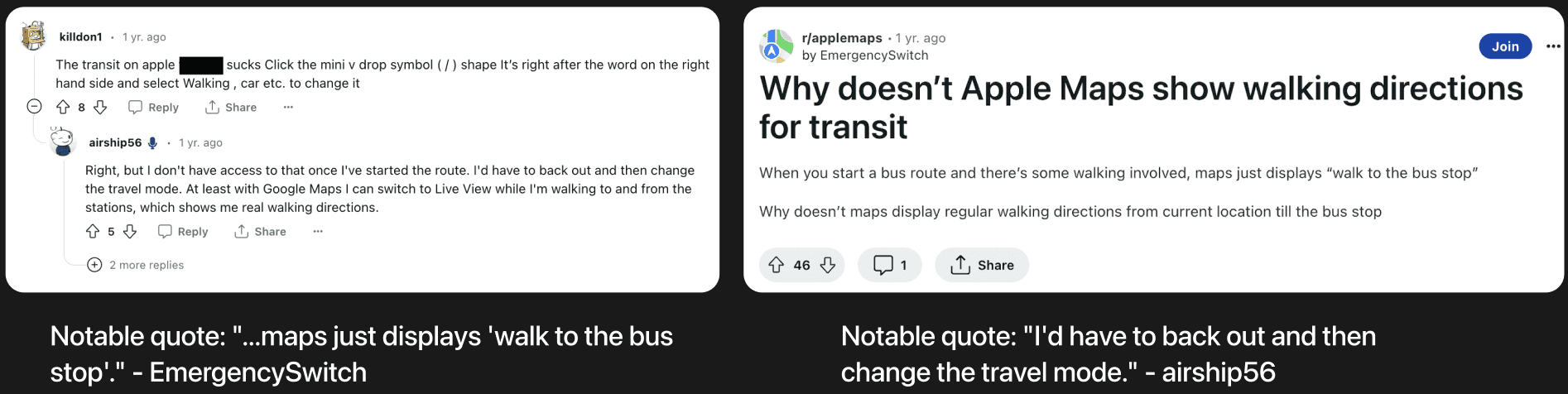
"...if you walk off route, it doesn't recalculate. Gotta follow the dotted line no matter what!" written by Ravage-1

I explored the discussion thread outlet Reddit to discover users' honest thoughts. Reddit has been known as a platform where users are able to discuss their true thoughts due to the anonymity and simplicity of the platform. With this in mind, I searched for other users' opinions on the transition between Public Transit and Walk Modes and saw that people had similar experiences to mine.
Research Takeaways
I concluded my research with two key pain points that affect the user experience in Apple Maps.
Key Pain Point 1
Ending a current route to switch travel Modes is inefficient
It is time-consuming to have to go step by step to switch into Walk Mode, especially when users are in a rush.
Key Pain Point 2
The dashed route display in Walking View during Public Transit Mode is hard to navigate.
Users have different preferences on how they want their route to be displayed (dashed, dotted, or unified).
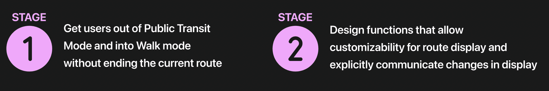
Concluding my research, I created two stages that outline my project goals.
A feature to transition into Walk Mode and implement features that enhance visibility in Walk Mode
Analysis Phase
Affinity Mapping
To organize and analyze both my data and pain points, I created an affinity diagram.

User Personas
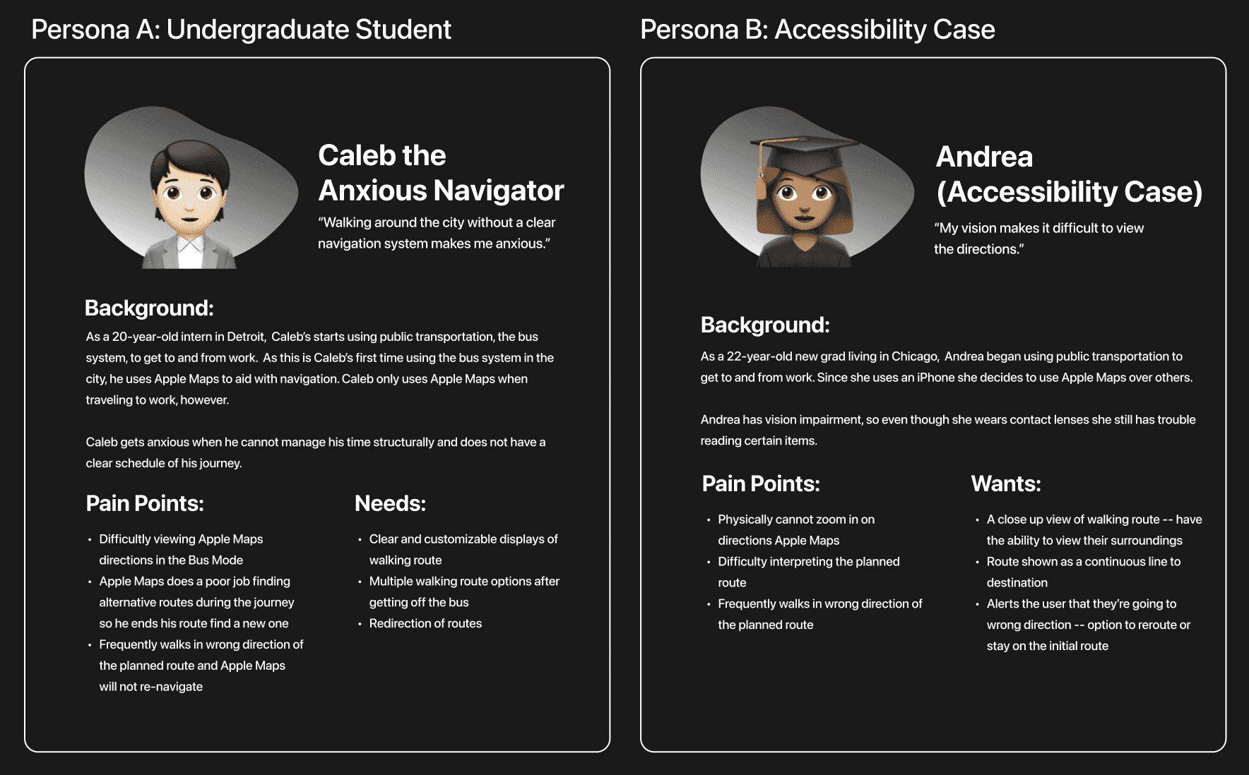
Mapping out my data and insights, I put together two personas that encapsulate the pain points and wants of Apple Maps users.
I ensured my personas accounted for different experiences and potential health impairments to analyze how those affect their time using Apple Maps.
Ideation Phase
Current User Journey & Satisfaction
The Walk mode's functionalities after the Public Transit to Walk transition are limited.
Currently, when users end their bus or train route and are prompted to start walking to their final destination, user satisfaction begins to drop off due to the lack of cohesiveness.

New User Flow
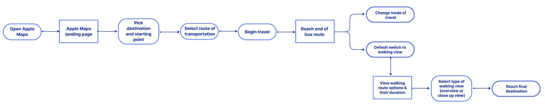
I created an overall user flow that allows for more visibility within the route displays.
I developed a user flow that lays out how users would interact with Apple Maps if my ideations were implemented. After refining my design decisions based on the users' pain points and preferences, I created a potential user flow to identify potential bottlenecks in my ideas and, ultimately, finalize the design structure.
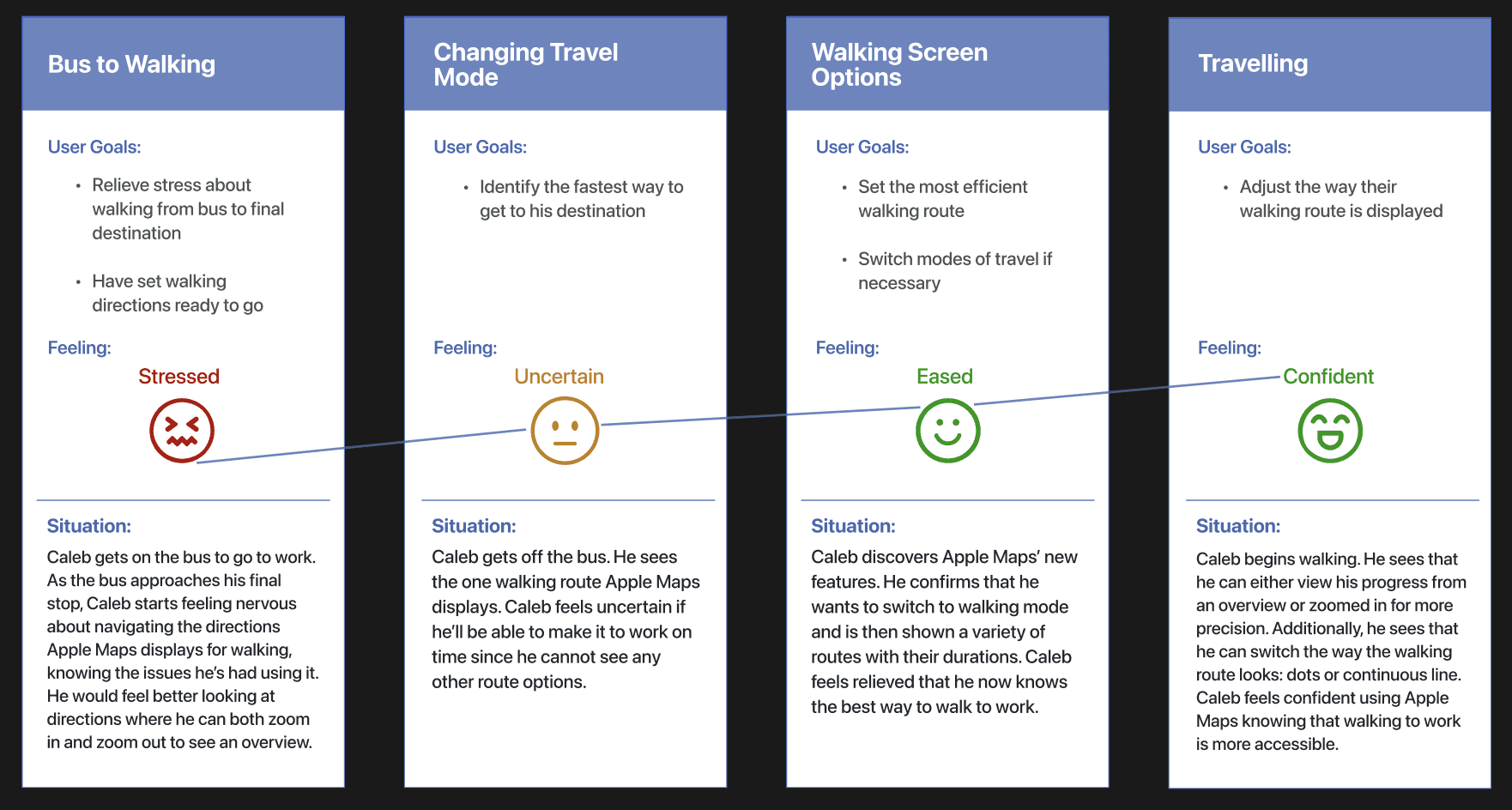
New User Journey With Updated Features
This new Journey follows Caleb's (Persona A) emotions while using Apple Maps with the new design solutions.
Iterations + Testing
Stage 1: Switching Between Travel Modes During An Active Route Following Steering's Law
Dropdown Menu Box Feature
Low-Fidelity Wireframes & User Feedback
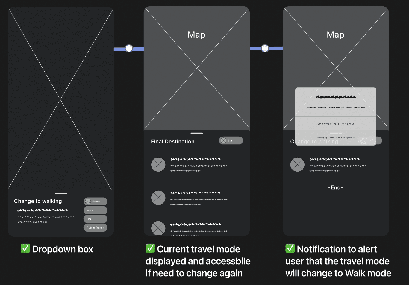
Iterating low-fidelity wireframes using my research data, I conducted 5 user surveys to learn if users understood the general layout and features at a baseline level. Users found the layout to be accessible and understandable. With that, I transitioned into designing high-fidelity wireframes.
Testing & Final High-Fidelity Wireframes

Turning my low-fidelity designs to high-fidelity, I ran into areas where I was unsure about the placement of features. I wanted to ensure that the dropdown box wouldn't hinder the user's view of the directions, so I conducted A/B testing. 76% voted that they preferred option B because the dropdown feature didn't obstruct the map view. With Steering's Law in mind, I aimed to minimize as much movement when switching travel modes for an efficient experience.
Stage 2: Route Displays Following Hick's Law
Route Style, Zoom In/Out, and Redirections
User Feedback & A/B Testing
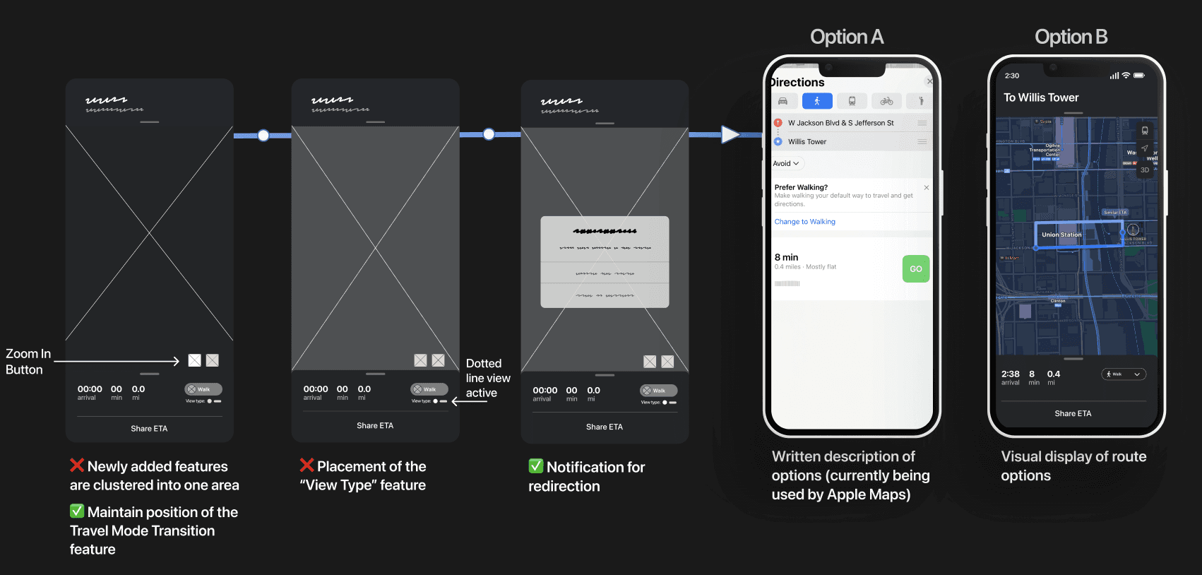
From the portion of the user surveys that regarded route displays, I learned areas from my low-fidelity wireframes that caused confusion for the users. The new features I wanted to add to the interface were too clustered together and caused sensory overload for some. With the feedback on my lo-fi. wireframes, I iterated my high-fi. frames.
I conducted A/B testing to see if users preferred Apple's current design which is a written view of route options (Option A) or my proposed design solution being more of a visual display (Option B). 82% participants preferred option B.
Testing High-Fidelity Wireframes

I implemented the feedback from A/B testing and ensured all my designs took the visual approach rather than the written view. Conducting usability testing on my final wireframes, I found that users preferred the enhancements in visibility for directions. I wanted to ensure I followed Hick's law and didn't overload the user with many display options. Users felt satisfied and preferred the following...
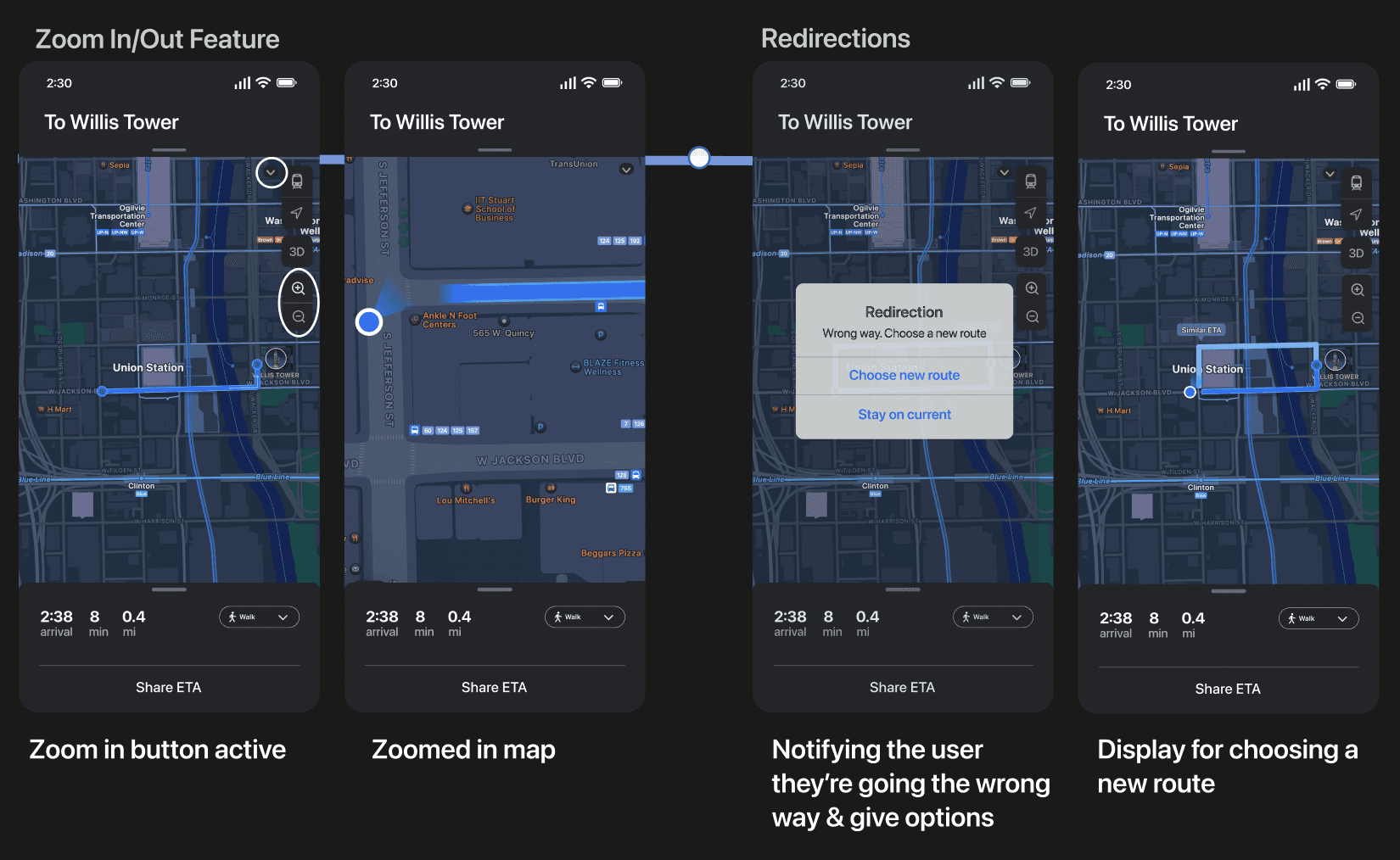
Switching the travel mode at any point of the journey
Customizing their route appearance
Being notified whenever there was a change in route such as the redirection notification
Having a clear zoom in & out button on the side of the screen
Design Solutions
Apple's Design System
Following and applying Apple's design system and guidelines, I created features that are feasible and can be used in the iOS environment.

Dropdown Menu to Switch Travel Modes
Switching from Public Transit to Walk modes

Currently, users have to end their current journey to switch travel modes (eg. drive, walk, etc). This process is inefficient and time-consuming, especially when users are on public transportation and need to track the transit in real-time.
With the new dropdown menu feature, at any point of a user's trip, users can switch travel modes to view their route from various perspectives without ending their current journey.
Route Display Options
Route Style and Zoom In & Out

On Apple Maps, users do not have the option to switch the style of their route (eg. line, dotted, dashed). Users also have to pinch their screen to zoom in and out which is a problem for users with dexterity issues.
With a zoom in and out button on the screen, users are able to use less motor function by pressing buttons. To prevent the side buttons from obstructing the screen, I added an arrow icon for toggling between open and closed positions.
Redirections

When on the Walk view while in the Public Transit mode, users are not redirected when they walk a different direction.
Utilizing the Walk mode interface Apple already has in place, I designed a notification to create a clear alert for users to notice they're headed the wrong way. When users choose a new route, they will be shown visual options of potential walking routes. Clicking on the preferred route will start the trip.
Reflections
Project Takeaways
I learned the following about the design process and will adjust my approaches for future projects.
Leveraged an existing design system rather than starting from scratch
During this project, I was able to focus a lot more on solving user pain points rather than hyper-fixating on visuals due to the fact that I was implementing Apple's current design system.
Expand into generative research methods
Conducting user interviews and Contextual Inquiry, I can better define and empathize with users’ situations. By observing users in context, I can understand how users think when navigating through map directions and the pain points they come across, which will help identify what users need from web mapping platforms in general.
Study competing platforms to develop a web mapping app
By extending my research to explore methods of enhancing accessibility across many web-mapping platforms for public transit, instead of just Apple Maps, I can be better equipped to ideate a design system for a web-mapping app that fosters intuitive user interactions.

